

Communicating Your Science Visually
Tips to create a visual explanation graphic for your scientific platform, product, or service


IMAGES SELL IDEAS. They achieve that ‘quick get’ that words alone can’t produce. Images and graphics are often the first things a reader will look at in a journal article, after the title/abstract. Great pitch decks rely on a solid illustration or infographic that is the centerpiece of the presentation because it explains your science visually.
Medical and scientific illustrators are experts at creating stunning graphics that explain a company's subject matter as well or better than the company’s own words. They have the tools and art skills to draft the figure’s composition of practical objects or abstract ideas plus they have the industry experience and jargon to help translate any technical information into something a targeted audience can understand. Having this creative resource can be a tremendous benefit to your work as these specialized artists will produce awesome graphics that break down complex science ideas by leveling up your R&D, grant and/or FDA submissions, journal articles, lectures, pitch presentations, and even customer acquisition—which seriously boosts your company's chances of success.
What if a medical/scientific illustrator isn’t available to you? How do you start creating a figure yourself? To lend a hand, below are some tips to help guide you through your own creation journey—at least until you can hire a bona fide medical artist for your mission 😎
Creating a Mechanism of Action (MoA) figure
A key visual explanation of your product/service will do a lot of heavy lifting. Even if you can’t afford someone to render it for you, getting it done by your own hand provides several benefits:
Helps you think through the verbal pedestrian pitch
Allows others to see your vision no matter how crude the drawing is, allowing you to workshop and refine it
Documentation for further iterations
When the opportunity is ripe, you’ll have reference scrap to provide to the artist/art team who is capable of creating a more professional version
A quick note on software/tools—There’s a lot of digital apps available to produce what you need. Understand that some programs are good for generating data content like Prism, MATLAB, Excel. And others for illustration and layout like, Photoshop, InDesign, PPT, Figma, etc. Most professional grade subscription based software like Adobe Illustrator, is an industry standard for digital art creation but does have a competing open source version, like Inkscape. You’ll most likely use a combination of software to generate all the elements and then layout your figure. Artificial Intelligence (AI) has been available for a while, however, use it sparingly as it’s limited to remixing and recombining patterns in their training data, AI is not truly creative, and they are proven to add bias and misinformation in their outputs.
MoAs should be engaging, informative, and persuasive. A drawing can be rendered in many styles from abstract to literal, yet it doesn’t need to be photo-real, rather it’s used to add additional information that clinical images are unable to provide. This is what you’re going for, communicating meaning.
Custom figures often incorporate clinical imagery that can be enhanced with arrows, typography, and other art elements that support your ideas. There are many graphic design principles that can be listed… Here are a few common ones to be mindful of:
Establish a story and hierarchy for best flow, prioritizing the most important aspects of the figure. Good storytelling requires identifying the heroes and focusing on a couple details rather than showing all the minutiae of your data—Remember to support your story by sticking to the plot. Hierarchy helps to structure your story, helping to make meaningful connections between the data and your ideas.
Law of common region (how items are grouped together). The principle of common region says that items within a boundary are perceived as a group and assumed to share some common characteristic or functionality1
Negative space or white space is the area around the layout, typically the margins and gaps inside, and between elements that contain no ink on the page. Negative space is as important as the other elements within your figure, which allows for breathing room, balancing the aesthetic and readability of your graphic layout. This aids in meaningful structure and relates to the law of common region mentioned above.
Emphasis, making elements different is often used for hierarchy and highlighting relevant data/information within a slide or figure, ie, setting a figure element apart from its surroundings. This aids with the efficiency of your visual and also aligns the correct idea to be communicated from your graphic.

There are several facets listed below divided into two sections. The first section is about determining what needs to be communicated, i.e., finding the objective. And the second is how to execute on the objective, i.e., composition layout, art style, typography, labeling, etc. You might be tempted to skip the former, however this will lead to additional iterations during the execution phase. In pedestrian terms, you wouldn’t want to build a house without blueprints.
Finding the objective
Any visualization should be objective within a scientific context. Identify the question you’re answering with your graphic. This sounds like very basic advice, however, we get a lot of clients who are experts in their field but often miss key messages in their visual figures. If your article or presentation is about a protein-to-protein interaction, then some modest questions for the image to answer should be, “Is it clear that protein A is signaling to protein B?” What are the main components (protein shape or domains in this case) that determine the strength of the signal? Is it a binary signal, ie, on or off? Are there other pieces of the story important to show? Does this explain how the IP works? Etc., etc.
An objective should be easy to understand, concise, and very specific. It’s difficult to illustrate something that is too vague. The tighter the description, the easier it is to create the visual, the better likelihood your audience will understand what you’re communicating.
Examples of strong illustrated figure objectives
Show the mechanism of action of a CAR T Cell binding to a surface antigen of a cancer cell initiating a kill response
Elements needed: CAR T cell with surface receptor, tumor cell with surface antigen, granzyme/perforine release, dying tumor cell
An implanted device on the vagus nerve (cranial nerve X) below the collar bone, connected to the external controller, can stimulate seizure suppression via vagal afferents.
Elements needed: Device, vagus nerve with afferent arrows, clavicle and surrounding anatomy for orientation, head & neck with brain, seizure phases
The platform is comprised of three modules, 1) genetic data source, 2) AI and machine learning, and 3) output of drug candidates
Elements needed: List of source data from lab to clinic to libraries, input and outputs of AI/ML construct, drug candidate screening
Once you identify what the figure needs to show, you can begin to execute on the visual components and composition of the figure.
Executing the objective (Creating the graphic)
Starting with a blank canvas can be intimidating. To help focus what to draw, use these initial questions to ask yourself with pencil in hand. It’s always good to check your progress with these questions throughout the design process to make sure you’re on track and that your artwork is answering them with clarity:

Identify any physical items and symbols
Practical objects are very easy to depict in an infographic, because they exist in real life. Even if the object is a novel component to your IP, these objects have been derived from something familiar. What are the physical/tangible items used in your product/service?
Abstract ideas or processes can be trickier to illustrate, but not impossible. The use of symbols can be easily understood when placed in the appropriate context. For instance, showing an icon of a cloud next to a database icon/image communicates a cloud network. An example of blood vial with a magnifying glass over it to indicate a screening process. What are the symbols that communicate abstractions or actions in your process?


Showing what can’t be seen
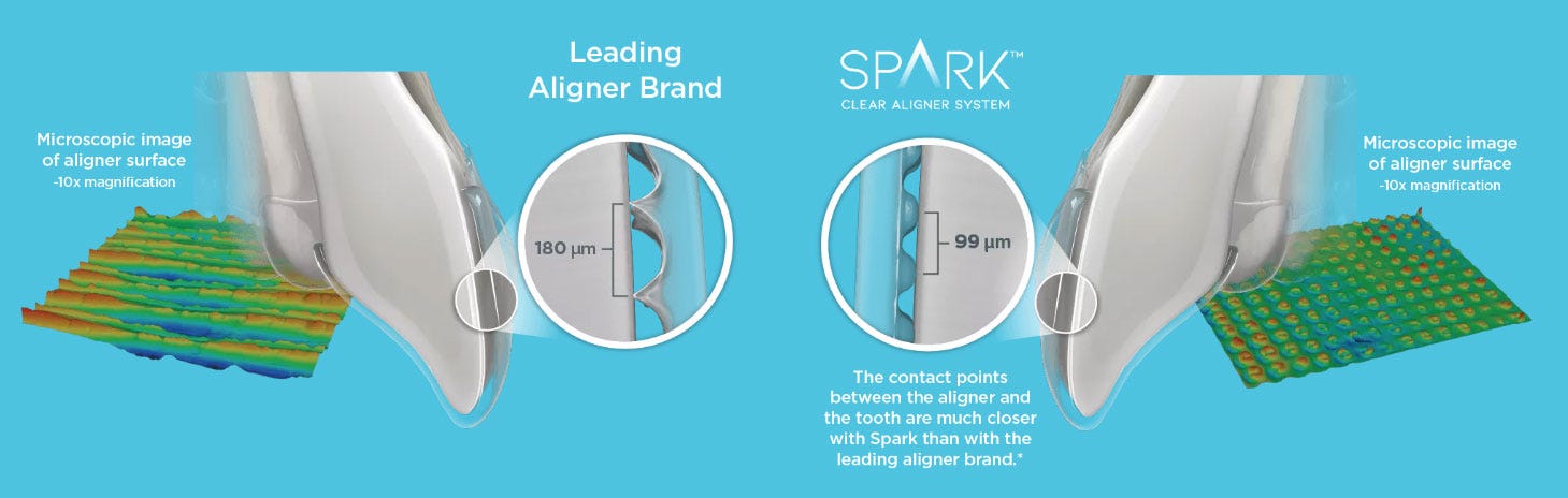
Identifying all the physical components of your subject matter gets you halfway there. Their juxtaposition will help communicate meaning. What is the change from before/after using your product or service? Are there quality differences, does the volume increase/decrease, etc? One very easy way to show differences is to show a comparison. This could be a before and after of your therapeutic treatment, or it can compare the quality of a competitor’s product or output to yours. Humans are really good at deciphering nuanced differences between objects, especially when displayed next to each other.
Showing a change or difference is the crux of your figure. It’s answering why your product/service is better. Getting this right means you have succeeded in communicating your idea with very little or no words at all. Ikea is known for wordless instruction graphics very well. Their reason is that they don’t need to translate their assembly instructions into hundreds of languages, saving them millions of dollars in printing fees for their entire product catalogue. Yet the visual library their instructions employ describe each step clearly for anyone to use. Below is a sample of one of Ikea’s instructions with our annotations in pink:

Arrows are more than verbs
One of the most common elements used in infographics and figures is the arrow. They are often used as guides pointing us to important information, they can convey change, movement or causality. Arrows are also used to show functional relationships.2

Arrow style, eg, the shape, size, and color, also can add to the explanation of specific concepts. However, it’s important to understand that arrows should not interfere with the main content. Using them only when needed and with clarity will make a figure more effective. Like a dashboard in a car, the gauges and instruments are important, but a driver’s eyes must focus on the road for safe driving.

Labeling and captions
Including detailed text helps clarify any context or meaning within your graphic. Labeling, such as labels and call-outs, identify components on your graphic and captions are typically short phrases or sentences to describe the graphic. The idea here is to make sure the graphic is easily understood by your audience, without ambiguity, especially for a quick read.

Cheat Sheet
Most of the effort creating an illustration is omitting information from your figure.
Text labeling and captions vary the size, color, or style, ie, regular, bold, etc, to create a hierarchy of importance with your information.
You have permission to draft several versions of the infographic. This helps with comparing which content and layout direction is better in a single production round versus iterating over a period of time.
This is an iterative process. Start with modest pencil sketches. From here any refinements could include swapping out figure elements, scaling different focal points within the art figure, editing labels and captions, or even adjusting flow layout if it’s a multi-step figure. By the time final sketches are sitting in a good place, then finalizing the art and typography becomes less tedious.
Test your graphic with others who align with your audience. It's even good to get a non-technical person to see if they understand what you’re communicating.
Documentative data like charts and graphs can be included in the infographic, but as a brief mention. Rather moving charts, graphs, or tables into a separate figure allows for any rich detail to be scrutinized better.
Data figures should and can be edited to enhance legibility. With charts and graphs for example, make the plot lines distinguishable from each other, increase text for title, axis, and legend labels will all help remove any uncertainty in your presentation.
Recap
Images sell ideas.
Medical and scientific illustrators specialize in creating visually stunning and informative graphics that can enhance communicating your ideas. Their multidisciplinary expertise and strong media production skills are invaluable for producing artwork for R&D, grant and FDA submissions, journal articles, lectures, pitch presentations, and even customer acquisition.
Stuck with the process or need to DIY and need to bounce ideas?—Drop us a line at hello@mitopop.com
Further reading:
Building Science Graphics, by Jen Christiansen
Approaches for Science Illustration and Communication, by Mark Roughley
Bang Wong; Nature Methods 8,701 (2011) doi:10.1038/nmeth.1676 Published online 30 August 2011
Medical illustrations by Justin Klein, CMI; Illustration support by Emily Cheng, CMI and Sofia Venezia for Mito Pop.
© 2025 Mito Pop. All rights reserved.